
Beautiful Visualization: How Do We Achieve Beauty?

This article is an excerpt from Beautiful Visualization: Looking at Data through the Eyes of Experts.
Given the abundance of less-than-beautiful visualizations, it’s clear that the path to beauty is not obvious. However, I believe there are ways to get to beauty that are dependable, if not entirely deterministic.
Step Outside Default Formats
The first requirement of a beautiful visualization is that it is novel, fresh, or unique. It is difficult (though not impossible) to achieve the necessary novelty using default formats. In most situations, well-defined formats have well-defined, rational conventions of use: line graphs for continuous data, bar graphs for discrete data, pie graphs for when you are more interested in a pretty picture than conveying knowledge.
Standard formats and conventions do have their benefits: they are easy to create, familiar to most readers, and usually don’t need to be explained. Most of the time, these conventions should be respected and leveraged. However, the necessary spark of novelty is difficult to achieve when using utilitarian formats in typical ways; defaults are useful, but they are also limiting. Defaults should be set aside for a better, more powerful solution only with informed intent, rather than merely to provide variety for the sake of variety.
Default presentations can also have hidden pitfalls when used in ways that don’t suit the situation. One example that I encountered was on a manufacturer’s website, where its retailers were listed alphabetically in one column, with their cities and states in a second column. This system surely made perfect sense to whoever designed it, but the design didn’t take into account how that list would be used. Had I already known the names of the retailers in my area, an alphabetical list of them would have been useful.
Unfortunately, I knew my location but not the retailer names. In this case, a list sorted by the most easily accessible information (location) would have made more sense than a default alphabetic sort on the retailer name.
Make It Informative
A visualization must be informative and useful to be successful. There are two main areas to consider to ensure that what is created is useful: the intended message and the context of use. Considering and integrating insight from these areas is usually an iterative process, involving going back and forth between them as the design evolves. Conventions should also be taken into consideration, to support the accessibility of the design (careful use of certain conventions allows users to assume some things about the data—such as the use of the colors red and blue in visuals about American politics).
Intended Message
The first area to consider is what knowledge you’re trying to convey, what question you’re trying to answer, or what story you’re trying to tell. This phase is all about planning the function of the visual in the abstract; it’s too early to begin thinking about specific formats or implementation details. This is a critical step, and it is worth a significant time investment.
Once the message or goal has been determined, the next consideration is how the visualization is going to be used. The readers and their needs, jargon, and biases must all be considered. It’s enormously helpful in this phase to be specific about the tasks the users need to achieve or the knowledge they need to take away from the visualization. The readers’ specific knowledge needs may not be well understood initially, but this is still a critical factor to bear in mind during the design process.
If you cannot, eventually, express your goal concisely in terms of your readers and their needs, you don’t have a target to aim for and have no way to gauge your success. Examples of goal statements might be “Our goal is to provide a view of the London subway system that allows riders to easily determine routes between stations,” or “My goal is to display the elements in such a way that their physical properties are apparent and predictions about their behaviors can be made.”
Once you have a clear understanding of your message and the needs and goals of your audience, you can begin to consider your data. Understanding the goals of the visualization will allow you to effectively select which facets of the data to include and which are not useful or, worse, are distracting.
Context of use. It’s also important to recognize the distinction between visuals designed to reveal what the designer already knows, and visuals intended to aid research into the previously unknown (though the designer may suspect the outcome in advance). The former are tools for presentation; the latter are tools for examination. Both may take standard or unconventional formats, and both benefit from the same process and treatments. However, it is important to be clear about which type of visual is being designed, as that distinction affects all subsequent design choices.
Visualizations designed to reveal what is already known are ubiquitous, appearing wherever one party has information to convey to another using more than just text. Most graphs and charts that we encounter are meant to communicate a particular insight, message, or knowledge that is evident in the underlying data: how a team is performing, how a budget is divided, how a company is organized, how a given input affects a result, how different products compare to each other, and so on. The data might reveal other knowledge or insights as well, but if they aren’t important for the purpose at hand, the design need not focus on revealing these other messages or trends. The process of designing these visualizations is therefore aided by having a well-defined goal.
Visualizations designed to facilitate discovery are commonly found in more specific, research-oriented contexts in science, business, and other areas. In these cases, the goal is typically to validate a hypothesis, answer a specific question, or identify any trends, behaviors, or relationships of note. Designing these visualizations can be more challenging if it’s unclear what insights the data may reveal. In contexts where the shape of the answer is unknown, designing several different visualizations may be useful.
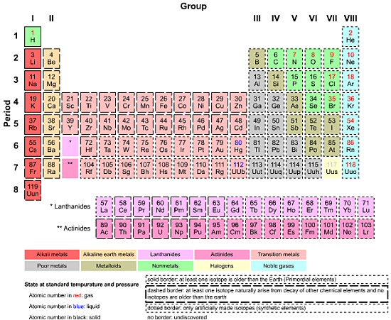
The periodic table is an interesting hybrid of these purposes, in that it was used to visualize both known and unknown information. The structure of the table was defined by the properties of the elements known at the time, so in that way it was a reference to existing knowledge, as it is used today. However, this structure resulted in gaps in the table, which were then used to predict the existence and behavior of undiscovered elements. In this latter mode, the table was a tool of research and discovery.
How to Win Stakeholders & Influence Decisions program

Gain the power skills you need to grow your influence on critical product decisions.
Get mentored and coached by Jared Spool in a 16-week program.
Learn more about our How to Win Stakeholders & Influence Decisions program today!