
Components Versus Patterns

Invariably at the outset of planning a component library, stakeholders will query “Ah, yes, so we are building a pattern library?” Actually, no. Although the two concepts are strongly related, their differences warrant consideration to ensure you are building the type of library that’s right for you.
What is a Pattern?
A pattern is a global solution to a common design problem, such that you could use the solution many times and never quite use it the same way twice.
For example, there’s no reason for a designer to not employ the common tenants of tabs (such as at least two tabs are required), video playback (that can be played or paused), or authentication (that, at a minimum, requires some form of username and password). Patterns are essential in interaction design, serving as a basis for designers to apply common, consistent conventions whether or not those solutions are actually catalogued in a library specific to an organization.
What is a Component?
On the other hand, components are a reusable, design system-specific chunk of a page. Such components—also known as modules, chunks, portlets, widgets, blocks, or other labels depending on the design context—are aggregated to compose an entire page or view. Each component has a specific application within a page grid and may have prescriptive specifications for behaviors, formats, editorial, visual style, and variable treatments.
How Are Components and Patterns Related?
Patterns and components can be quite complementary and coexist within design solutions, even if (almost always) they are not the same thing.
Consider the home pages for two different experiences, fancast.com and comcast.net, both properties owned by Comcast Interactive Media and mapped together via navigation back and forth between sites. The two home pages could be broken down into components (represented by orange boxes), many of which are reused on other pages of each experience. Each home page also employs many patterns (identified by the red callouts).
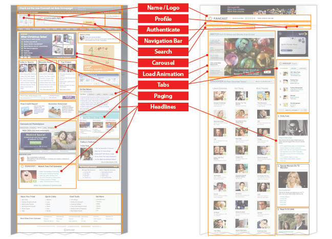
Are the components and patterns the same? Not at all. The two design solutions share no components whatsoever, existing within entirely different visual systems of grids, typography, layout, color, and navigation models. However, the two page designs share (at least) 5 patterns, including search, authentication, carousel, headlines, and tabs.
Component Design Inspired by a Pattern
Often, many components in a library will utilize the same pattern. For example, consider the tab pattern that enables a designer to segment content into sections, all accessible but only one visible within a layout at a given time. On cnn.com, tabs are instantiated into numerous components for grouping financial markets by global regions (Asia, Europe, US), article content by type (read, video, map, or chart), and videos by category (most popular, top stories, staff picks, and more).


In every case, the design adheres to the fundamentals of a tab pattern, such as distinguishing the active tab from other tabs. However, the usage, page region, style, and design details differ considerably across each component.
Reconciling a Pattern from Components
Similarly, inconsistencies across many component designs can be reconciled into a pattern to establish a common baseline across teams and efforts.
For example, consider countless video players proliferating needlessly throughout the sections and contexts of a website: embedded in a product spotlight, a different player in a different spotlight, unique players in lightboxes & popups, new players for content from the training group, etc. Built by different teams at different times, the designs all play video amid UI controls with inconsistent behavior and appearance.
Teams can resolve differences via a pattern for basic facets like play/pause, scrubber, timing (current and overall duration), and volume. With a pattern in place, consistency increases but teams can still flexibly include (or omit) additional controls and features—video size, full screen view, rating, commenting, embedded code—for a specific component in the context of their solution.
How Are Components and Patterns the Same?
Both patterns and components are reusable design solutions for specific problems. This reuse—and the consistency and cost-savings that result—is the key selling point of both patterns and components.
In addition, patterns and components can be:
- Described via attributes like Use When, Rationale, and Solution Guidelines
- Managed in a library
- Rendered as reusable assets, whether HTML/CSS frameworks or design libraries used in wireframe or comp production
- Utilized during projects by information architects, interaction designers, visual designers, design technologists (ie, HTML/CSS/JS jockeys), and other disciplines
- Authored and maintained via a (hopefully well) defined workflow
- Based on the design needs of an organization
- Influenced and enhanced based on user research
How Are Components and Patterns Different?
Despite their similarities, components and patterns differ in important ways. At a high level, patterns are meant to serve as baselines open to interpretation and application by a designer; on the other hand components are quite specific to an established design and thus more prescriptive and fixed.
Additional distinctions include:
| Distinction | Patterns | Components |
| Types | Could be a page chunk (log in module), flow (shopping from product to cart to checkout to receipt), behavior (e.g., autocomplete), or something else | Always a chunk of page or screen design |
| Specificity | Globally applicable across a range of contexts, even if elements are similar | Specific to one design system, including layout, color, type, and behaviors |
| Location | Up to the designer to appropriately apply principles and locate within a screen design | Targeted to specific location(s) within a page layout, based on approved usage |
| Style | Abstracted from any specific skin, and flexible to adapt to many visual treatments | Finished within one visual system, although variations may be defined |
| Editorial | Perhaps some basic editorial guidance | Specific data, formats, guideline, style/tone, and even defined feed |
| Markup & Code | While starter code may be available, it needs to be tailored to fit the system | Ideally represented by formalized html, javascript, and CSS if the library is built |
| How It Works | Represents how a design should work, under preferred conditions (but may suggest how to cope with tradeoffs) | Represents how a design does work, inclusive of the tradeoffs and constraints established during the design process |
What Kind of Library Should You Build?
Since the two library types are different, then which one is right for you?
Patterns are ideal for teams that design many experiences, such as a team like Yahoo’s that designs a plethora of products each with a unique visual system but needing to adhere to a larger, common brand. Components have proven ideal for other teams, such as Sun Microsystem’s sun.com library that synthesizes a massive collection of pages, sections, teams, and content into a common, single design system and experience.
But, this may not be an either / or question, since depending on your circumstances, you may benefit from one or both types of libraries. In fact, one team built libraries for both patterns (e.g., Tabs) as well as components (e.g., tabbed product details, tabbed content module, tabbed search results, etc). Other teams have hedged their bets by embedding aspects of one approach into the guidelines and spirit of the other, most commonly via pattern-like guidelines incorporated into the more specific component definitions.
Consider a pattern library especially if your team has:
- Numerous visual systems that are intentionally different or will not be reconciled
- Capability to document patterns more specific than public libraries already in existence
- Known opposition to prescriptive approaches, but a willingness to use common guidelines
Consider a component library especially if your team has:
- A specific visual design system, including grid(s), layout, color palettes and typography
- Many reusable components (page “chunks”) within that system
- Diverse groups (and resources within disciplines) across an organization that must work together to evolve and publish against using that system
- Interest in and capability of sustaining that design and code system across groups, projects and time
- Strong, centralized influence to create, deploy, and maintain a library (or plans to centralize influence via a library)
How to Win Stakeholders & Influence Decisions program

Gain the power skills you need to grow your influence on critical product decisions.
Get mentored and coached by Jared Spool in a 16-week program.
Learn more about our How to Win Stakeholders & Influence Decisions program today!