
Making Online Information Usable
So you follow all the standards and guidelines, but suffer nagging questions about whether anyone can and will use the help you’ve just written. Or management wants you to move your printed documentation online, but you wonder whether that’s really best for your users.
In the course of our consulting work, we’ve done dozens of usability studies that focus on how people use a variety of printed and online documentation, including manuals, help, cue-cards, and wizards. We’d like to share some of our results and observations, in hopes that this will help you make more informed design decisions.
Types of Usability Problems
There are hundreds of usability questions that arise as you’re creating an information set. In the past two months, we’ve had clients ask us everything from “Should we have one space after a period or two?” to “Which information should we put in which medium?”
Usability problems fall on a continuum. On one end are the nuisance problems, like typos or incorrect grammar. Users may not notice these issues, and can ignore them if they do.
At the other end are the exasperation problems. For example, users can’t find the information they need, or a description doesn’t make sense. Users who trip over these may abandon the documentation and call the support hotline, or worse yet, give up on the product entirely.
This spectrum also indicates what we need to know to solve the problem. Solving nuisance problems requires you to know only about conventions and human behavior. For instance, knowing that spelling errors cause the average person to read slower and possibly lose their train of thought is all we need to understand. In these cases, solutions that work for one product usually work for others as well.
Exasperation problems are where you can get the biggest usability wins. Unfortunately, they are also the hardest to solve and the ones many companies spend the least time on.
To solve exasperation problems, you need to know a lot about the work your users do with your products. Will they be troubleshooting different system components to solve a problem? What context are they working in? What skills do they have? The solutions employed for one product will be unique to that product.
The information we present here comes from a variety of studies, but they are not studies of your users interacting with your product. As you read this article, remember that your mileage may vary. Supplement this with your own usability research.
Different Purposes for Print and Online
We recently studied two similar user groups—Sybase system administrators keeping their mission-critical applications running and Visual Basic programmers creating mission-critical applications. The documentation was the same—a combination of print and online reference material written at similar levels of detail. However, Sybase administrators only used and wanted printed documentation, while Visual Basic programmers were so dependent on their online information they didn’t even know where their printed manuals were. What was the difference?
At first we thought it might be due to the documentation itself. But when we looked at the information set, we found that the electronic and paper versions for each product were virtually identical. Nor was the Visual Basic documentation more complete or thorough than the Sybase documentation.
Our epiphany came when we watched users work. Visual Basic programmers often had questions about a specific function. When they entered the documentation, they went straight to the examples and supporting text. They mentally resolved their issues while in the help and then returned to their code to make changes.
Sybase administrators, on the other hand, worked differently. When an issue would arise, they would also go into the documentation. However, they often had to use several functions, with several corresponding peeks at the documentation. Because these functions often displayed their intermediate results on the screen, the administrators couldn’t have the electronic documentation covering their workspace. Even though they were using large screens and windowing environments, they needed the full screen to display their work and couldn’t sacrifice any of it to the documentation.
For some types of work, such as troubleshooting, users need to see many different information sources at once. That’s why the system administrators were so enamored with their printed manuals. They could spread a half-dozen different books out on their desks and feel confident they were seeing all the information they needed. Online help, on the other hand, behaves much like a child standing in front of the television—obscuring the stuff the user is most interested in.
In deciding whether to put something online, think about how much of the screen your users need to see. If they need to focus on the entire screen to accomplish the majority of their work, consider staying with print.
Users Go to Help for Two Purposes
In hundreds of usability tests, we’ve only ever seen users go into help for two reasons: (1) they are confused about something on the screen, or (2) they need to find specific functionality.
The first case occurs when users don’t know how to respond to a prompt. For instance, in the Microsoft Excel 5.0 function wizard, to calculate the payment on a loan, users were stumped by the prompt Interest Rate:. While they knew what an interest rate was, they didn’t know how to respond. Should they type in 8.25 or .0825 or 8.25%? Every user we watched went to help to find the answer. (Actually, the correct answer was 8.25%/12. The program wanted a per-payment interest rate rather than a yearly interest rate.)
The second case arises when users are aware of a function, but don’t know how to get to it. For instance, users in Lotus Approach knew there was a way to locate a specific record in a database, but didn’t know what it was. They would go into the help and search for a synonym of locate. (The function was called Find.)
We suggest you build your help with these two activities in mind. Make sure you explain how to answer every prompt. Also, make sure users can find descriptions of each function, even if they don’t know what your product calls something.
Users Navigate through Search
The index is the primary user interface to technical documentation, both print and online. In all of the testing we’ve done, it is the first place users go when they have problems.
In fact, we’ve neverseen users choose to use a help contents page. When they have accidentally gone to the contents page, users try to get off it as quickly as possible. Even when the writer has spent time “designing” the contents page—adding graphics, chunking information, and so on—users flee.
We recommend developing the index first. How? Most writers we work with start by writing outlines. If you turn your outline on its side and alphabetize the key terms, you’ll have a preliminary index.
To evaluate that index, show people before and after pictures of some functionality. (Like a spreadsheet with just data and then a spreadsheet with both data and a graph.) Then ask them to look up in your make-shift index how they would produce that result. Have them tell you the entries they look up as they go. Add any missing ones to your list. The more people you show your pictures to, the more useful entries your index will have.
Online Overviews Don’t Help
Anytime we’ve seen users presented with electronic overviews, their first response is to scroll beyond the overview or close the window. One user we observed closed an overview with crucial material, stating that it was “just information.”
Users commonly say they would review overview information before working with the product, perhaps by doing a tutorial or skimming the manual. But their actions differ. Once they start working with the product, they make it clear that overviews are not desirable.
This is not good news, since many products are moving to online-only documentation. In some isolated cases, we’ve seen users print out documentation and read it offline. But for the most part, users rely on the interface itself to make the concepts behind the program explicit. If you can make trade-offs, focus on making the concepts obvious from the interface, rather than describing them in help.
Exemplary Examples
Users consistently gravitate to examples. In fact, we’ve seen cases where help topics with only examples (no additional text) were phenomenally successful.
But not all examples are equal. The best ones tend to include special cases in addition to the normal problems. They are also visually separated from the rest of the text.
One of the most prominent features of Visual Basic’s online help is the plethora of example code. We’ve seen many users copy this code right from the help into their own programs, and then modify it to suit their needs, without ever reading the surrounding text.
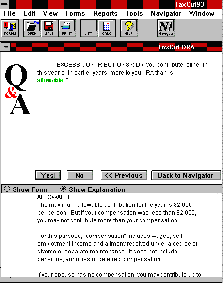
In Meca’s TaxCut, the help is full of examples. These examples not only explain each question on the tax form, but help the user figure out the proper answer. In the example in Figure 1, when explaining the term “allowances” for IRA contributions, the text walks through several scenarios, such as with or without a working spouse. Users just need to find the example that matches their situation to answer the question.
Examples must be complete, however. In comparing the examples of Lotus 1-2-3’s help with Microsoft Excel’s, we saw that users were more successful at creating formulas in 1-2-3. It turns out that the 1-2-3 documentation always put the “@” character in front of the function, whereas the Excel documentation didn’t include the requisite “=”. As a result, Excel users would omit the “=” and receive unexplainable syntax errors. We watched users go back into the help and check their work, sometimes as many as three times, not understanding why it wasn’t accepting the formula they copied verbatim from the example.
Sometimes the Cost of Help Isn’t Worth It
Imagine these two conversations at a restaurant:
Conversation #1
Waiter:Would you like soup with your meal?
Guest: What soups do you have today?
Waiter: We have Chicken & Rice or French Onion.
Guest: I’ll have the French Onion.
Conversation #2
Waiter: Would you like soup with your meal?
Guest: What soups do you have today?
Waiter: I don’t know. Let me go in the kitchen and check with the chef.
Guest: Never mind, I’ll skip the soup.
The difference between these is the cost of the answer. In the first conversation, the guest got the answer immediately. In the second, the delay was too much so they opted to continue without getting the information.
We’ve seen the same phenomena in testing. Users often avoid help because of the delays associated with it. They fear that, after a hefty time investment, they won’t find anything helpful.
We’ve seen promising results with buttons labeled Hints or Tips. These bring up small dialogs, with short explanations, usually in the context of the user’s work. Users subconsciously perceive that it won’t cost them much to get the information, so they explore these buttons.
The Science of the Obvious
Once you start watching your users work with your products and documentation, the usability problems will become obvious. Correct the nuisance problems when you can, but remember that you’ll get the biggest improvements by fixing the exasperation problems.
How to Win Stakeholders & Influence Decisions program

Gain the power skills you need to grow your influence on critical product decisions.
Get mentored and coached by Jared Spool in a 16-week program.
Learn more about our How to Win Stakeholders & Influence Decisions program today!