
The Top 20 Data Visualization Tools

Originally published at Creative Bloq on September 17, 2012.
One of the most common questions I get asked is how to get started with data visualizations. Beyond following blogs, you need to practise—and to practise, you need to understand the tools available. In this article, I want to introduce you to 20 different tools for creating visualizations: from simple charts to complex graphs, maps and infographics. Almost everything here is available for free, and some you have probably installed already.
Entry-level tools
At the entry level, we’ll be looking at unexpected uses for familiar tools. You might not think of Excel as a visualization package, for example—but it’s capable of surprisingly complex results. If you are just getting started, these tools are musts to understand. If you deal with visualizations every day, you’ll quickly find yourself advancing beyond them, but not everyone will, so you’ll always be dealing with data coming in from sources you’d rather not deal with.
1. Excel
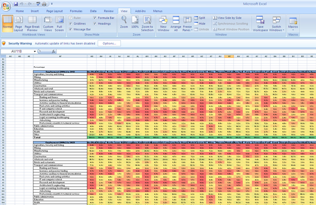
You can actually do some pretty complex things with Excel, from ‘heat maps’ of cells to scatter plots. As an entry-level tool, it can be a good way of quickly exploring data, or creating visualizations for internal use, but the limited default set of colours, lines and styles make it difficult to create graphics that would be usable in a professional publication or website. Nevertheless, as a means of rapidly communicating ideas, Excel should be part of your toolbox.
Excel comes as part of the commercial Microsoft Office suite, so if you don’t have access to it, Google’s spreadsheets—part of Google Docs and Google Drive—can do many of the same things. Google ‘eats its own dog food’, so the spreadsheet can generate the same charts as the Google Chart API. This will get your familiar with what is possible before stepping off and using the API directly for your own projects.
2. CSV/JSON
CSV (Comma-Separated Values) and JSON (JavaScript Object Notation) aren’t actual visualization tools, but they are common formats for data. You’ll need to understand their structures and how to get data in or out of them. All of the following toolkits accept at least one of the two formats as input.
Online visualizations
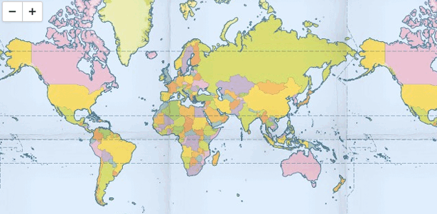
3. Google Chart API
The portion of the toolset for static images has been deprecated, so the Google Chart Tools site now only offers tools for dynamic charts. They are robust and work on all browsers supporting SVG, canvas and VML, but one big problem is that they are generated on the client side, which creates problems for devices without JavaScript, offline use—or just when saving in different formats. Static images didn’t have the same issues, so I’m sorry to see them go.
However, the API has just about everything but the kitchen sink, from bar charts and line graphs to maps and even QR codes. You will probably find the right visualization for your needs as long as you are comfortable with the Google look and not in need of extreme customisation. As a jumping-off point, it is a great tool to know how to use.
4. Flot
Flot is a great library for line graphs and bar charts. It works in all browsers that support canvas—which means most of the popular ones, with some extra libraries to get canvas to work as VML in older browsers. It’s a jQuery library, so if you’re already familiar with jQuery, it’s easy to manipulate the calls back, styling and behaviour of the graphics.
The nice thing about Flot is that you have access to plenty of callback functions so you can run your own code and style the results when readers hover, click, mouseout, and other common events. This gives you much more flexibility than other charting packages, but there is a steeper learning curve. Flot is also limited to line and bar charts. It doesn’t have as many options as other libraries, but it performs common tasks really well.
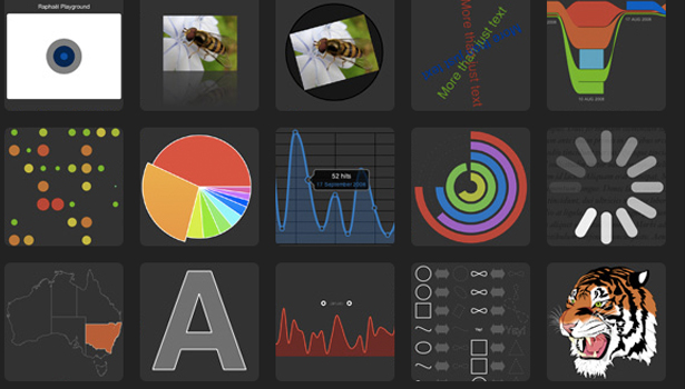
5. Raphaël
Raphaël is another great JavaScript library for creating charts and graphs. The biggest difference to other libraries is that it focuses on SVG and VML as output. This has pros and cons. Since SVG is a vector format, the results look great at any resolution; but since it creates a DOM node for each element, it can be slower than creating rasterised images via canvas. However, the upside is that you can interact with each DOM element and attach events, just like HTML.
The website includes plenty of demos to show how easily Raphaël can create common charts and graphs but, because it can also render arbitrary SVG, it has the ability to create some very complex visualizations for which you might otherwise have to resort to other vector tools such as Illustrator or Inkscape.
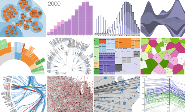
6. D3
D3 (Data-Driven Documents) is another JavaScript library that supports SVG rendering. The examples go beyond the simple bar charts and line graphs to much more complicated Voronoi diagrams, tree maps, circular clusters and word clouds. It’s another great tool to have in your toolbox, but I wouldn’t always recommend D3 as the go-to library. It’s great for creating very complicated interactions—but just because you can, it doesn’t mean you should. Knowing when to stay simple is a big part of choosing the right visualization tool.
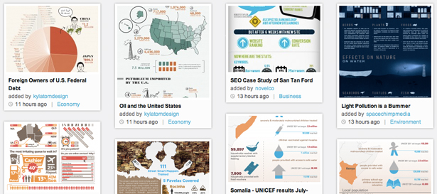
7. Visual.ly
If you are in need of an infographic rather than a data visualization, there is a new crop of tools out there to help. Visual.ly is probably the most popular of these. Although primarily an online marketplace for infographic designers, its Create option lets you pick a template, connect it to your Facebook or Twitter account and get some nice cartoon graphics back. While the results are currently limited, it’s a useful source of inspiration—both good and bad—and a site I expect to see grow in future, accepting more formats and creating more interesting graphics.
Interactive GUI controls
What happens when data visualizations become so interactive they themselves become GUI controls? As online visualizations evolve, buttons, drop-downs and sliders are morphing into more complex interface elements, such as little handles that let you manipulate ranges, changing the input parameters and the data at the same time. Controls and content are becoming one. The following tools will help you explore the possibilities this offers.
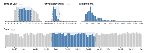
8. Crossfilter
As we build more complex tools to enable clients to wade through their data, we are starting to create graphs and charts that double as interactive GUI widgets. JavaScript library Crossfilter can be both of these. It displays data, but at the same time, you can restrict the range of that data and see other linked charts react.
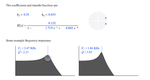
9. Tangle
The line between content and control blurs even further with Tangle. When you are trying to describe a complex interaction or equation, letting the reader tweak the input values and see the outcome for themselves provides both a sense of control and a powerful way to explore data. JavaScript library Tangle is a set of tools to do just this. Dragging on variables enables you to increase or decrease their values and see an accompanying chart update automatically. The results are only just short of magical.
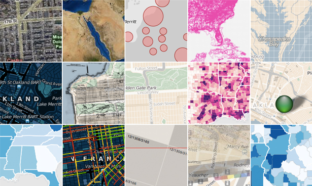
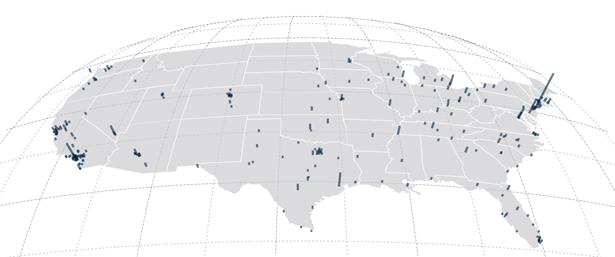
Mapping
Mapping used to be a really hard task on the web. Then Google Maps came along and blew away every preconceived notion of how an online map should work. Soon after, Google released its Maps API, which allowed any developer to embed maps in their own sites.
Since then, the market has matured a great deal. There are now several options out there if you are looking to embed custom mapping solutions in your own data visualization project, and knowing when to choose one over the others is a key business decision. Sure, you can probably shoehorn everything you need into any of these maps, but it’s best not to have a hammer and view every problem as a nail.
10. Modest Maps
Modest Maps is a tiny mapping library. Weighing in at only 10kB, it is the smallest of options discussed here. This makes it very limited in its basic form—but don’t let that fool you: with a few extensions, such as Wax, you can really make this library sing. This is a product of Stamen, Bloom and MapBox, so you know it has an interesting track record.
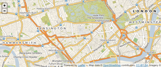
11. Leaflet
Brought to you by the CloudMade team, Leaflet is another tiny mapping framework, designed to be small and lightweight enough to create mobile-friendly pages. Both Leaflet and Modest Maps are open source projects, which makes them ideal for using in your own sites: with a strong community backing them, you know they won’t disappear any time soon.
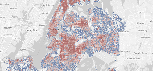
12. Polymaps
Polymaps is another mapping library, but it is aimed more squarely at a data visualization audience. Offering a unique approach to styling the the maps it creates, analagous to CSS selectors, it’s a great resource to know about.
13. OpenLayers
OpenLayers is probably the most robust of these mapping libraries. The documentation isn’t great and the learning curve is steep, but for certain tasks nothing else can compete. When you need a very specific tool no other library provides, OpenLayers is always there.
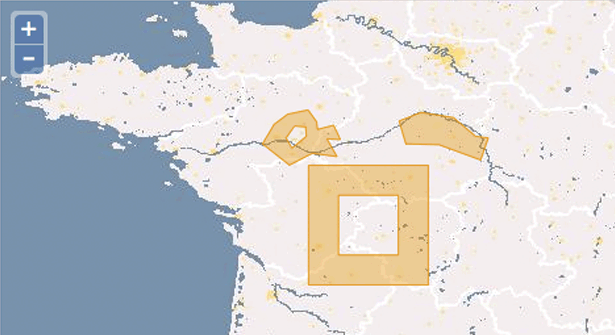
14. Kartograph
Kartograph’s tag line is ‘rethink mapping’ and that is exactly what its developers are doing. We’re all used to the Mercator projection, but Kartograph brings far more choices to the table. If you aren’t working with worldwide data, and can place your map in a defined box, Kartograph has the options you need to stand out from the crowd.
 Kartograph’s projections breathe new life into our standard slippy maps
15. CartoDB
Finally, CartoDB is a must-know site. The ease with which you can combine tabular data with maps is second to none. For example, you can feed in a CSV file of address strings and it will convert them to latitudes and longitudes and plot them on a map, but there are many other users. It’s free for up to five tables; after that, there are monthly pricing plans.
Charting fonts
One recent trend in web development is to merge symbol fonts with font embedding to create beautifully vectorised icons. They scale and print perfectly, and look great on newer Retina devices too. A few of these fonts, such as FF Chartwell and Chartjunk, have been specially crafted for the purpose of displaying charts and graphs. They have the usual problem of OpenType not being fully supported in all browsers, but they’re something to consider in the near future.
Getting serious
If you’re getting serious about data visualizations, you need to move beyond simple web-based widgets onto something more powerful. This could mean desktop applications and programming environments.
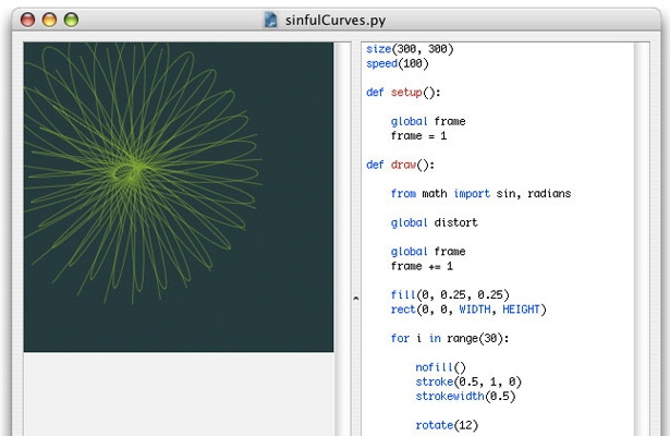
16. Processing
Processing has become the poster child for interactive visualizations. It enables you to write much simpler code which is in turn compiled into Java. There is also a Processing.js project to make it easier for websites to use Processing without Java applets, plus a port to Objective-C so you can use it on iOS. It is a desktop application, but can be run on all platforms, and given that it is now several years old, there are plenty of examples and code from the community.

17. NodeBox
NodeBox is an OS X application for creating 2D graphics and visualizations. You need to know and understand Python code, but beyond that it’s a quick and easy way to tweak variables and see results instantly. It’s similar to Processing, but without all the interactivity.
Pro tools
At the opposite end of the spectrum from Excel are professional data-analysis tools. If you are serious about data visualization, you need to be at least aware of, if not proficient in, some of these. Industry-standard tools such as SPSS and SAS require expensive subscriptions, so only large institutions and academia have access to them, but there are several free alternatives with strong communities. The open-source software is just as good, and the plug-ins and support are better.
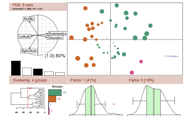
18. R
How many other pieces of software have an entire search engine dedicated to them? A statistical package used to parse large data sets, R is a very complex tool, and one that takes a while to understand, but has a strong community and package library, with more and more being produced. The learning curve is one of the steepest of any of these tools listed here, but you must be comfortable using it if you want to get to this level.
19. Weka
When you get deeper into being a data scientist, you will need to expand your capabilities from just creating visualizations to data mining. Weka is a good tool for classifying and clustering data based on various attributes—both powerful ways to explore data—but it also has the ability to generate simple plots.
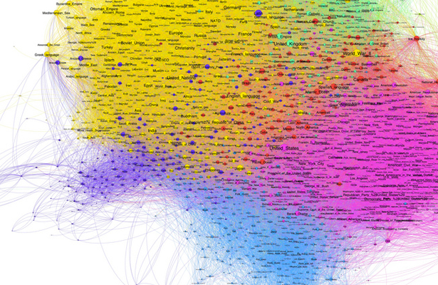
20. Gephi
When people talk about relatedness, social graphs and co-relations, they are really talking about how two nodes are related to one another relative to the other nodes in a network. The nodes in question could be people in a company, words in a document or passes in a football game, but the maths is the same. Gephi, a graph-based visualiser and data explorer, can not only crunch large data sets and produce beautiful visualizations, but also allows you to clean and sort the data. It’s a very niche use case and a complex piece of software, but it puts you ahead of anyone else in the field who doesn’t know about this gem.
Further reading
- A great Tumblr blog for visualization examples and inspiration: vizualize.tumblr.com
- Nicholas Felton’s annual reports are now infamous, but he also has a Tumblr blog of great things he finds.
- From the guy who helped bring Processing into the world: benfry.com/writing
- Stamen Design is always creating interesting projects: stamen.com
- Eyeo Festival brings some of the greatest minds in data visualization together in one place, and you can watch the videos online.
How to Win Stakeholders & Influence Decisions program

Gain the power skills you need to grow your influence on critical product decisions.
Get mentored and coached by Jared Spool in a 16-week program.
Learn more about our How to Win Stakeholders & Influence Decisions program today!