
Lifestyles of the Link-Rich Home Pages

The Dove home page is like many home pages on the Internet. It contains a handful of links (23 to be exact), a couple of pulldown menus and some nicely designed graphics. It’s certainly very pleasant to look at and matches the brand expectations Unilever has set up for the Dove product line.
Yet, does it work for the users? If the user is coming to get a new tote bag, wants a free deodorant sample, or is interested in seeing this month’s special offers, then it probably works well. Those links are the Featured Content and, chances are, only a small number of people visiting the site are coming specifically to see them. In fact, our studies show, on most sites, users come less than 5% of the time for featured content, even when heavy marketing campaigns are promoting that content.
The Dove site has hundreds of pages of content, describing the very wide selection of offerings in their product line and many potentially valuable resources for Dove’s customers. However, most of this content is invisible on the home page. Users can’t tell, when arriving on the site, if there are 20 pages or thousands.
How does someone whose skin reacts to the harsh chemicals found in most soap find out what Dove has to offer? The home page gives no indication Dove offers products for this, even though sensitive skin has been a mainstay of Dove’s product line since its early days.
The Dove Site Map
Contrast the Dove home page to the Dove site map. Using 5 times as many links, this page gives a real picture of the content of the site. Even with 148 links, it is well designed and organized nicely. It’s easy for users to find what is available quickly.
Someone looking for a gentle soap can quickly find the sensitive skin products. A quick scan of the page reveals several choices for the user to explore.
What’s the difference between the home page and the site map? The site map makes the content transparent, whereas the home page’s design makes the content opaque.
The design of Dove’s Site Map is what we’d call Link Rich, while the Dove home page is Link Poor.
Keeping Things Simple
Nobody starts their design with the objective, “We need our home page to be as complex as we can possibly make it.” On the contrary, everybody wants to build simple designs. Yet, somewhere along the line, simplicity translated into “Provide as few links on the home page as possible.”
News sites understand this. One could imagine a home page for a news site with only these links:
- Top News
- Local News
- Sports News
- Financial News
- Funny News
- Brad Pitt / Angelina Jolie News
On a simplified news site, that’s all that would be required. It would make home page maintenance a dream. You’d never have to change it.
However, it wouldn’t make for a good news reading experience because users want to see what headlines are under each category. Instead, they make the news transparent by providing a link-rich environment.
Recently, the New York Times redesigned the home page on NYTimes.com. Did they opt for the simple Link-Poor approach we outlined above? No.
Instead they went very Link-Rich, weighing in at a whopping 397 links on an average day’s page. That’s a lot of links to update and maintain, but they must feel it’s worth it, since it provides every visitor with a solid picture of the news they are reporting.
The BLS Evolution
A few years back, the US Bureau of Labor Statistics came to us with their simple home page. The simple design managed to encompass the thousands of pages of available statistical data into 11 links. This design approach proved to be very frustrating for users.
After working with them on what we’d been seeing, they tried a revised page. This page added 60 more links, making the most important content transparent. The result: users loved it.
This only encouraged the BLS design team. They’ve revised their design a couple more times, with the current page logging in at more than 180 links.
The BLS site is for statisticians, analysts, and economists. It’s not a site for consumers. If you look closely at the links, you may find it hard to work through. However, chances are, you’re not a member of the site’s target audience. The audience loves the latest Link-Rich design, which is all that matters in the end.
The BLS users found the site had become simpler with each revision, even though the team was dramatically increasing the number of links on the page. Exposing the underlying information enhanced the simplicity of the site.
The Extremely Link Rich: McMaster-Carr
If you’re thinking 397 links on the New York Times site is a lot, you should check out the more than 700 links provided on McMaster-Carr’s home page. This design is a link-rich transparency at its most extreme.
Even with all these links, the target audience of this site loves it. Like the BLS site, they are a niche group: people who buy building materials and tools for very large construction and building-maintenance projects. A typical user may use the site multiple times each day to order unique items. They are very familiar with McMaster-Carr’s 4,000 page catalogue, often looking items up by the page number in the book.
The secret to the McMaster-Carr site is the link clusters. Users look at each cluster and quickly decide whether the cluster is likely to contain their content or not. By focusing on just one or two clusters, the user winnows down their choices to just a handful of links.
If the design team doesn’t make the clusters right, users won’t succeed. This site wouldn’t work if the links were in random groups.
Over the years, the design team has added more and more links, without hurting the design of the site. This suggests to us that, with a good design, the upper limit of links is much higher than we might’ve originally suspected.
Other Link-Rich Designs
Most sites can’t go to the extremes McMaster-Carr has. Their design calls for an audience that is very familiar with the all the site’s terms, including the ones they know they are not interested in. Many sites don’t fall into that category.
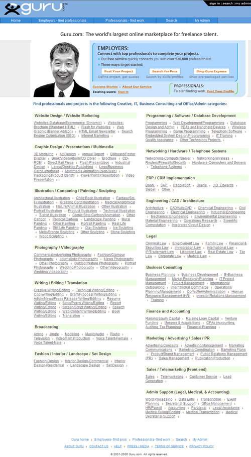
Yet, other sites have demonstrated that link-rich designs can work. Staples.com, an office supply e-commerce site, just relaunched with a 156-link design. Analog.com, an electronics component manufacturer, now has a 199 link site. Guru.com, a job site for technical freelancers, rings in at 127 links, while the infamous Craigslist.org, a classifieds site, has 130 links on their home page.
Each site has a radically different design, with very different looks and styles. Yet, all of them share the same objective: make the content of the site very transparent.
Making the Move to a Link-Rich Home Page
Dramatically increasing your content’s transparency on your home page is not a simple thing to do well. It takes research and experimentation. You need to understand the content your users desire. You need to know how to organize the links into the right clusters. And, you need to have a process that permits you to make the transition through multiple iterations.
To understand the content desired by your users, you need to know their trigger words—the word or phrase they’ll click on for the content they seek. Just populating a page with every possible keyword probably won’t get you the effect you want. The teams at Staples, Analog, and McMaster-Carr spent tremendous resources learning how their users thought about their content, through extensive site visits, interviews, and usability testing.
In addition to knowing the trigger words, you need to know how to cluster them together. Link-rich pages only work when users can quickly eliminate the stuff they don’t want and hone in on the few links that match their target. Card sorting and related techniques are critical to create quality clusters.
An iterative development process is critical to the success of these radical home page designs. The BLS design team made multiple iterations of their page, putting each one in front of users and collecting feedback. Each revision gave them more feedback on the trigger words, the clusters, and the transparency of the underlying content. We’ve yet to see anyone successfully build the right design in a single try. Building a process that allows for feedback and revision is key.
It’s no surprise to us that we’re seeing home pages everywhere moving to a link-rich design. The need for more transparency drives sites to add more links and as designers find creative ways to display all this rich information, users are finding the sites more useful. Link Poor home pages will become a thing of the past.
How to Win Stakeholders & Influence Decisions program

Gain the power skills you need to grow your influence on critical product decisions.
Get mentored and coached by Jared Spool in a 16-week program.
Learn more about our How to Win Stakeholders & Influence Decisions program today!